NUTRO, a brand under Mars, believes that every pet deserves to eat clean, are now setting a new standard by introducing clean recipes for their dry dog and cat food lines with real, recognizable ingredients.
As pet owners’ amount is growing rapidly, the whole Chinese pet care consumption scale reached to RMB 170.8 billion. Consumers now are willing to provide better life for their pets, and they truly care whether their pets are healthy and happy, so brand and quality are becoming the most important factors to trigger the sales.
When other pet food brands are trying to attract consumers’ attention by exaggerated designs or colorful patterns on the packaging, NUTRO chooses a low-key elegance, and pays more attention to emotional interaction with consumers.
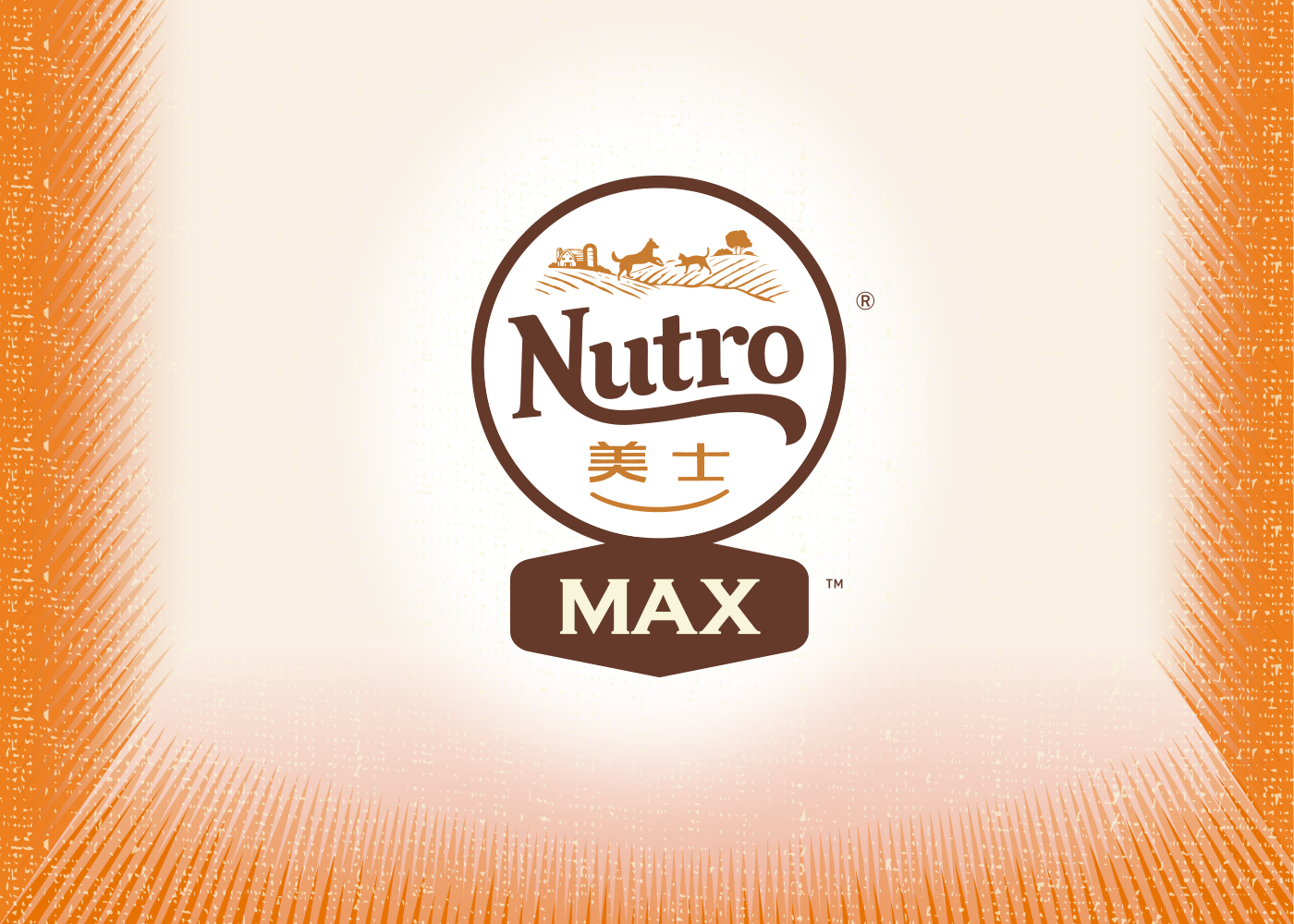
Foresee the Chinese natural pet food market trend, Mars decided to introduce NUTRO MAX product line into Chinese market, whose main claim is organic and grain free. Currently Nutro Max product line only has Dog food line globally, which is taking a sub-brand approach, with highlighting brand “Max”. While in China, client would like to take co-branding approach, keep the key visual consistent with Nutro Max globally. After restructure the key visual identity and the packaging lines for NUTRO MAX, ShinyBay was invited to create new design for the 2 series of NUTRO MAX cat& dog food packaging that aligns with the new visual style while enhances the organic feeling and premium-ness.
The design, as NUTRO clients expected, is natural, premium, and classic, highlights the iconic signs of the brand and unlike the intentional eye-catching style, it attracts consumers to dig deeper into the brand. ShinyBay retained the structure and illustration style of NUTRO as the brand identity. The structure was divided into 2 parts, up and down, which gives consistency between each variant, as well as makes the benefit information simple and clear. In the meanwhile, ShinyBay put a lot of thoughts on the illustration for cat food series, in order to keep the consistent style with Nutro Max Dog line in the US. The illustration shows a rather harmonious scene between pets and owners, in which we can see a quite cozy indoor environment, a girl lies on the sofa while her cat stands on the top of it. Same eye-level symbols the equal status between the owner and pet, to represent their relationship is more like partners. The whole picture conveys a bright and relaxing atmosphere, also inspire a life style that all consumers would like to have. Also, more natural colors were added into the design, while fabric and marble patterns were used in the background to enhance the overall natural and premium style.
The new series of packaging features a cozy, modern old-fashioned feeling intended to convey classic, organic, and natural ingredients, enhances the NUTRO brand image into consumers’ minds as well as elevates the role of the brand.